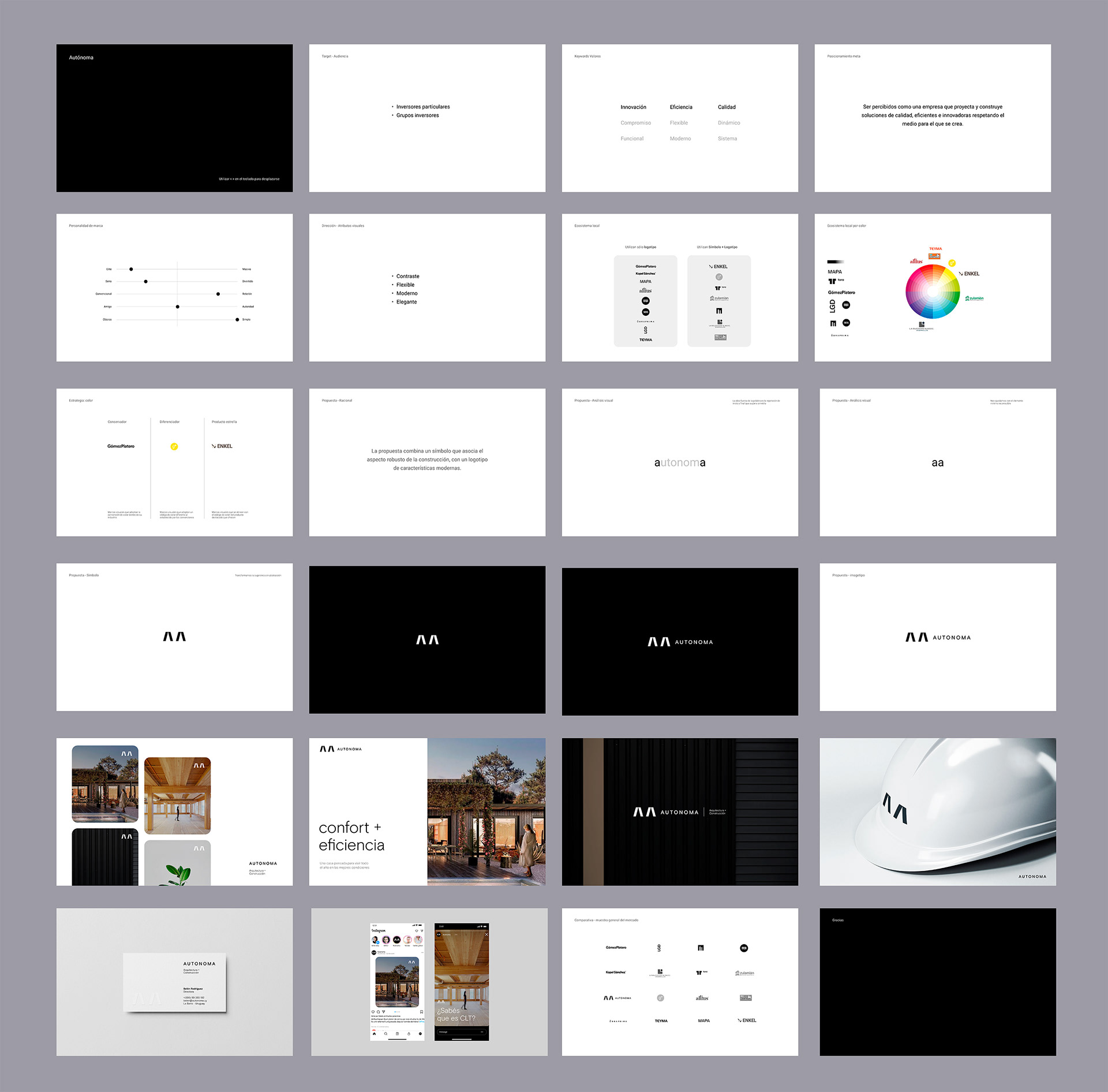
The visual identity of Autónoma reflects solidity, modernity, and versatility. The design combines a symbol that evokes construction’s robustness with a logotype aligned with contemporary digital trends.
The symmetry and repetition in the name reinforce stability and reliability, while the color and typography choices add flexibility and a modern aesthetic. Through this identity, Autónoma positions itself as a company that creates intelligent, efficient, and high-standard solutions, balancing industry tradition with digital evolution.
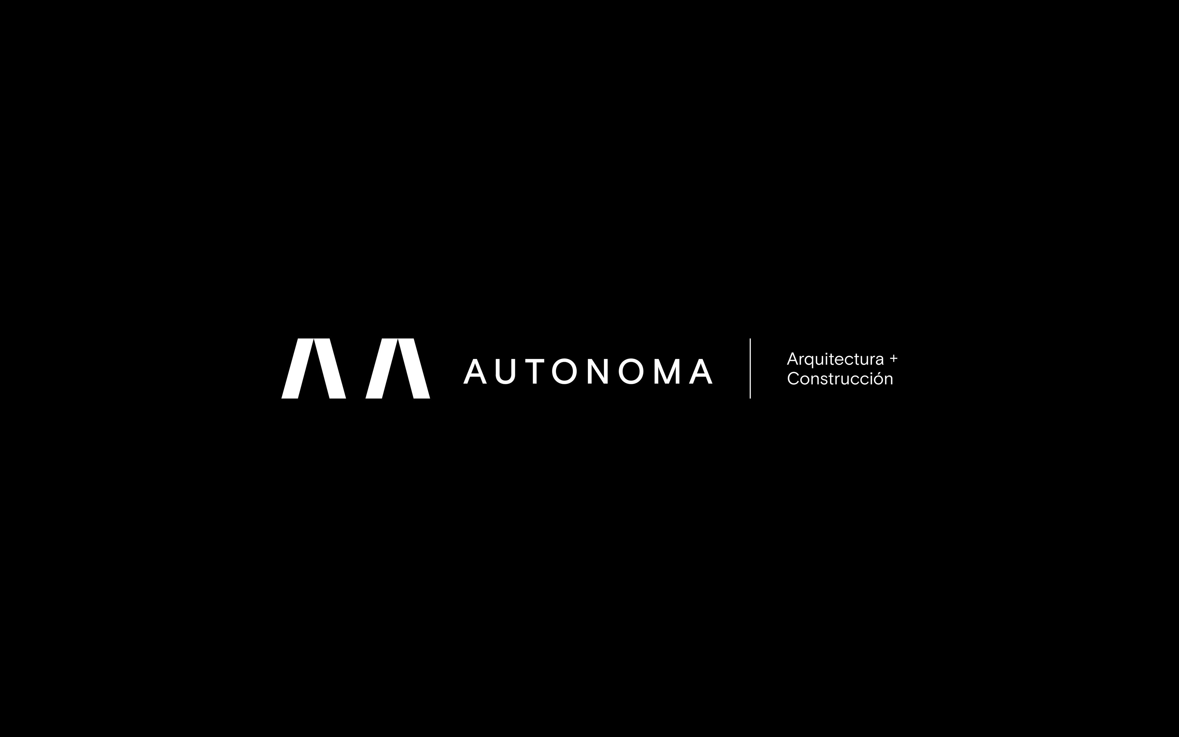
Visual Identity - Logo
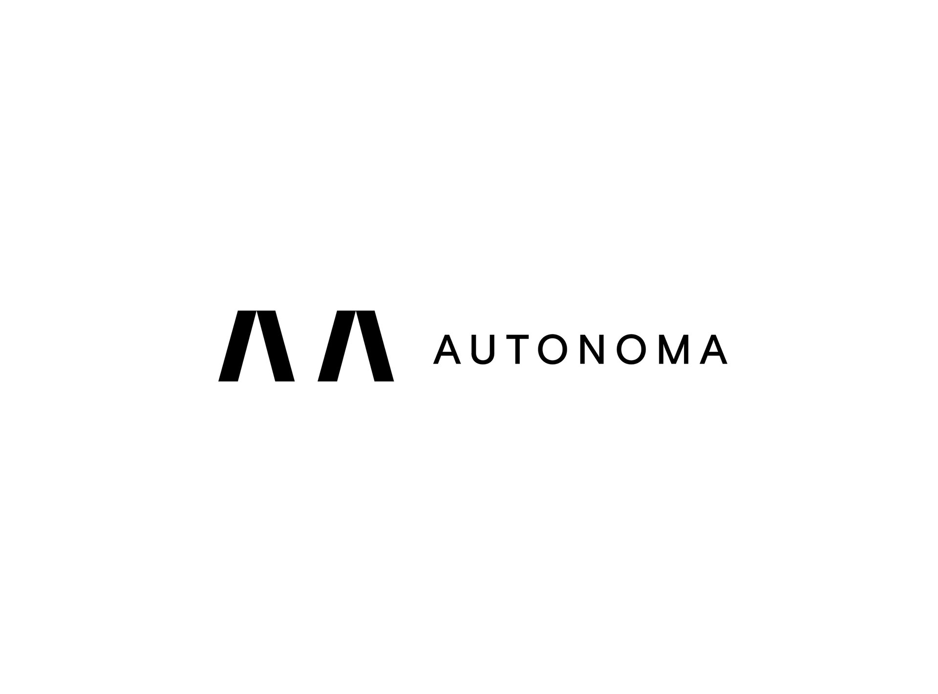
Visual Identity - Logo

Autonoma Branded Helmet

Brand Symbol Integration
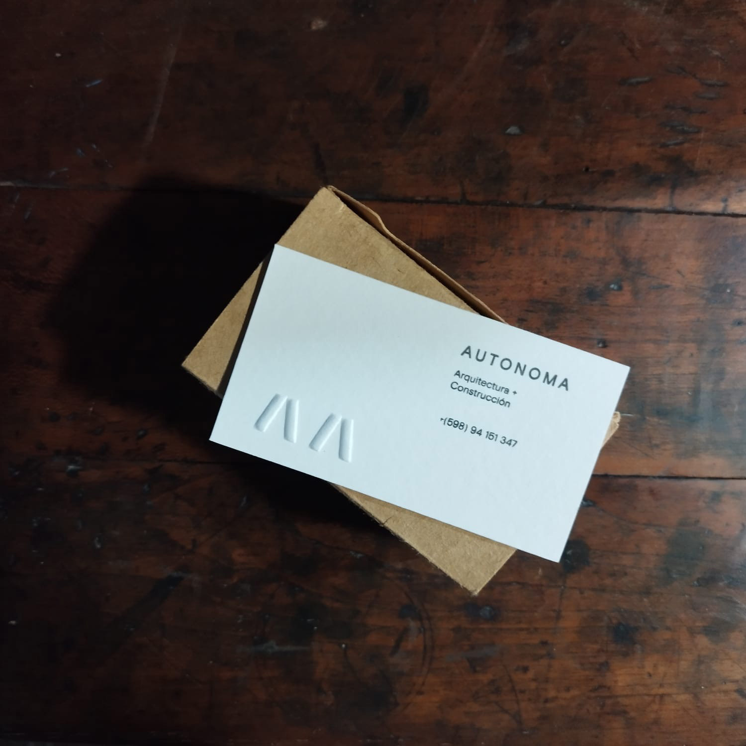
Business Card

Business Card
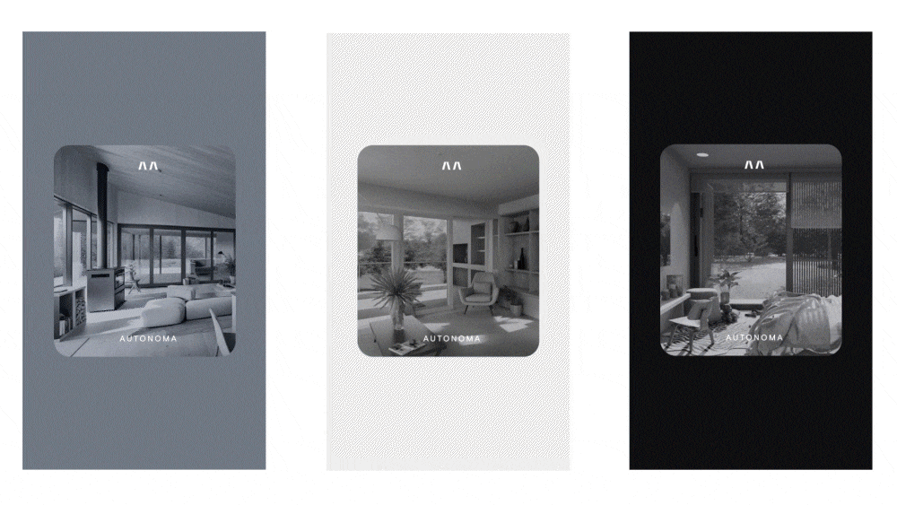
Instagram Stories
Concept & Visual Solution
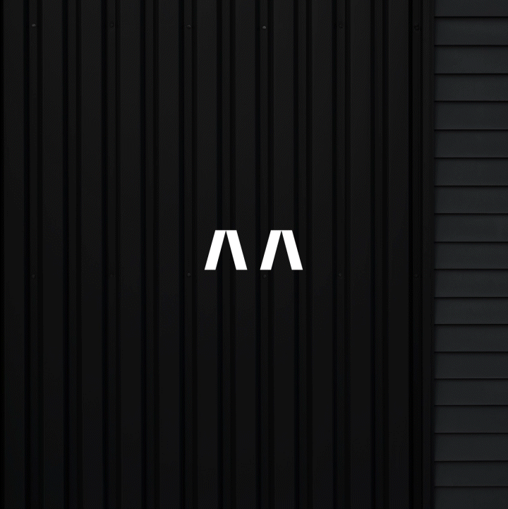
Logo Animation